
PRIVATE LESSONS:
Book Now (view coach profiles here):
Book Lesson with an Austin Velocity Coach (Book now, and we will match you with a coach for your time reserved)
Personal indoor volleyball training sessions for 1-4 players, customized with specific skills by your own private coach.
-
Sessions for 1-4 Players
-
Adaptable Areas of Emphasis
-
High Repetition, Personal Feedback
-
Lessons Available for:
- Middle School (Grades 5-8)
- High School (Grades 9-12)
- College (Freshman-Senior)
- Adult (All Ages)
*Please note that private lessons are dependent upon gym and coach availability. Certain times of the year will have more availability than others.
ALL LESSONS TAKE PLACE IN THE CEDAR PARK, TEXAS AREA
Group Session
Up to four players and a coach. Players grouped to enhance complementary skills (preferred): setter and hitters, passers and setter, hitters and defenders, blocking, etc. Little fatigue means high quality repetitions, also game-like visualization benefits, and value of camaraderie. Lowest individual focus, lowest amount of repetitions, lowest personal cost.
Two-Person Session
Two players and a coach. Players are paired in ways that will enhance both the quality of repetition and the ability of the coach to teach complementary or comparable skills. Suggested pairings are setter with a hitter, hitter with a libero/DS, or two players of the same position. There is some value in visualization also, watching the other player attempt the given skills. Shared individual focus, shared repetitions, lower cost per player.
Individual (Private) Lesson
The player is by herself with a coach. High quantity of repetition,
individual one-on-one focus means personalized instruction and attention.
Excellent for setters. Players with beginning to moderate skills in passing, serving, and hitting fundamentals. Highest individual focus, highest repetitions (which may cause fatigue), highest cost per player, lowest game-like visualization.
BENEFITS OF PRIVATE LESSONS
The benefits to signing up for private volleyball lessons are tremendous, but some of the most common benefits that players see from adding private lessons to their routine include:
-
Restore Confidence: Private volleyball lessons really give a player the extra attention to fine tune their talents and skills, while turning weaknesses into strong points. One-on-one private coaching increases an athlete’s ability to reach their full potential, while targeting weaker areas on the court, and improving those areas by targeting a plan specifically made for the player.
-
Prepare For School Teams: Maintain your skill level and keep your body in tip top shape for the time that your school’s volleyball season comes around. Our coaches provide inspiration and motivation that not only push players, but also help instill confidence in their game. When returning to your school’s volleyball team, you will be more than ready when you hit the court for practice, but also for your games!
-
Position: With the various positions found in volleyball, every player is trained differently, based on their position on the court. Not only is every player different, due to their own strengths and weakness, but each position varies. By combining training for both the player’s individual talents + fine tuning their position on the court, our private volleyball lessons are perfectly catered to give you the highest increase in your game.
Private volleyball lessons can be held at various locations including Cedar Park Rec Center (CPRC), Premiere Athletic Complex (PAC), Round Rock Sports Center (RRSC), Summit Christian Academy (SCA) and Austin Sports Center (ASC). The coach will work with you to coordinate availability and location.
Click Here for Maps to our Playing Locations.
COMMON PROBLEMS WE FIX!
Below is a list of common issues that can be corrected with focused instruction.
Standing Servers
- Inconsistent toss
- Stepping with wrong foot
- Dropping elbow below ear
-
Side arm swing
Jump Servers
-
Inconsistent toss
-
Wrong footwork
-
Hand placement on ball
-
Erratic serve locations (too high, too far, too wide)
Setters
-
Strength to set outside
-
Spin on sets
-
Sets too tight
-
Inconsistent location
-
Dropping hands when setting
-
Arching back when setting behind
-
Improper footwork
Serve Receive
-
Base position too high
-
False step when moving forward
-
Standing up before moving to ball
-
Bending elbows instead of angling platform
-
Crossing feet instead of shuffling
-
Waiting too long to react
-
Lack of aggression
-
Swinging platform when passing
Hitters
-
Timing (jump too early/late)
-
Feet to the ball
-
Ball behind hitting shoulder
-
“Goofy foot” (improper footwork)
-
Arm swing
-
Scissor/chair legs when attacking
-
No use of core muscles for power
-
Lack of rotation in hips and upper body
-
Hopping/Skipping during approach
-
Broad jumping towards the net
-
Landing on one leg
Passers/Diggers
-
Shanking passes to left or right
-
Getting feet to the ball
-
Bending elbows
-
Crossing feet
-
False step backwards
-
Standing up
-
Slow reaction times
-
Confusion between perimeter and rotation defense
-
Watching ball instead of hitter or setter
-
Letting balls drop between two players
-
Fear of diving for a ball
To get started with your private volleyball lessons, email us:
View coach bios here
For larger group lessons or any additional questions, email This email address is being protected from spambots. You need JavaScript enabled to view it.
ALL SKILLS DEVELOPMENT PROGRAM
Must be in 4th thru 9th Grade
Philosophy and Goals:
Spike Frog Volleyball has designed a developmental training program for beginning volleyball players in Grades 4-9. This training program creates an educational environment intended to challenge, engage and support the dedicated student volleyball athlete. Athletes that participate in this program will focus on the basics of serving and passing to improve their consistency. Those with a desire to focus on these skills will be rewarded with a confidence that comes from hard work and success.
Principles:
Our standards and principles tutor our young athletes that “Anything less than your best is unacceptable.” While we understand that every young athlete may not play college volleyball or compete in the Olympics, we know our training principles allow for the development of skills and experience applicable to other areas of life. We are truly passionate about working with young athletes who want to improve, raise their level of performance, and build self-confidence. Our goal-oriented program enables athletes to accelerate their progress.
Experience:
This training program is designed for athletes wishing to impr
ove their SERVE AND RECEIVE using the volley-lite or regulation volleyball – the two most important skills in volleyball.
Required:
- No previous experience
- No evaluation required
2024 Summer Dates Coming Soon!
Follow Us on Social Media and Join the Spike Frog Mailing List to be the first to receive League and Upcoming Program Announcements.
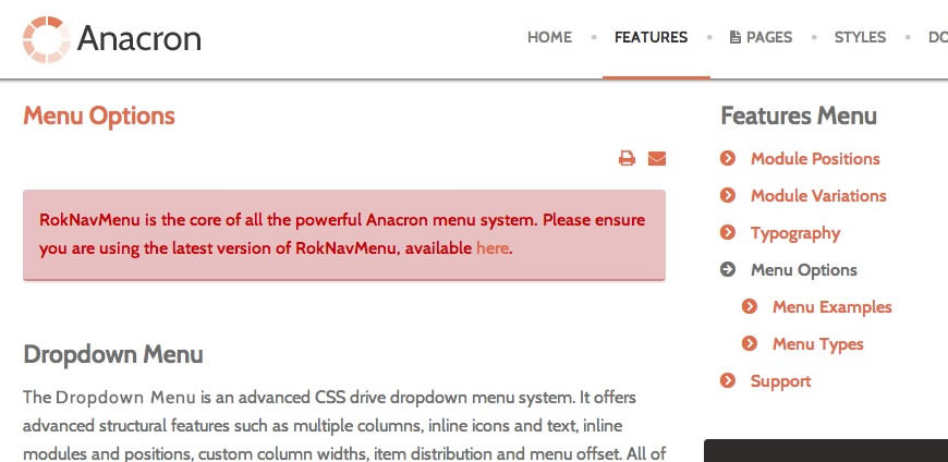
RokNavMenu is the core of all the powerful Anacron menu system. Please ensure you are using the latest version of RokNavMenu, available here.
Dropdown Menu
The Dropdown Menu is an advanced CSS drive dropdown menu system. It offers advanced structural features such as multiple columns, inline icons and text, inline modules and positions, custom column widths, item distribution and menu offset. All of these are configurable for each menu item.
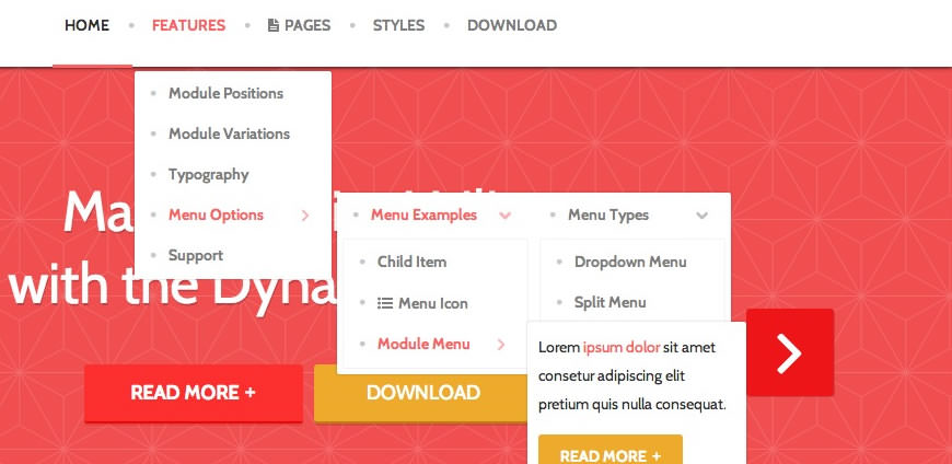
SplitMenu
A static menu system that displays 1st level items in the main horizontal menu and further children in the Sidebar.
All Menu Items can be edited from Admin → Menu → Menu Name → Menu Item.
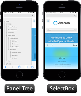
Responsive Mode: Smartphone
For mobile devices, there are two options, a dropdown panel menu with items in a tree format or a select box using the browsers own UI elements. Chose a format in the template's menu settings.
The mobile menu is active for both the Dropdown Menu and SplitMenu.
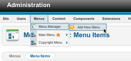
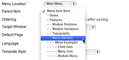
Creating child menu items
Go to Admin → Menu → A Menu → A Menu Item → Select a Parent Item, and it will appear as a child of it.
Headings
All HTML headings, <h1> through <h6> are available.
h1. Heading 1
h2. Heading 2
h3. Heading 3
h4. Heading 4
h5. Heading 5
h6. Heading 6
Built with Less
The typographic scale is based on two LESS variables in variables.less: @baseFontSize and @baseLineHeight. The first is the base font-size used throughout and the second is the base line-height. We use those variables and some simple math to create the margins, paddings, and line-heights of all our type and more. Customize them and Bootstrap adapts.
Body copy
Bootstrap's global default font-size is 14px, with a line-height of 1.7em. This is applied to the <body> and all paragraphs. In addition, <p> (paragraphs) receive a bottom margin of half their line-height (9px by default).
Nullam quis risus eget urna mollis ornare vel eu leo. Cum sociis natoque penatibus et magnis dis parturient montes, nascetur ridiculus mus. Nullam id dolor id nibh ultricies vehicula.
<p>...</p>
Lead body copy
Make a paragraph stand out by adding .lead.
Vivamus sagittis lacus vel augue laoreet rutrum faucibus dolor auctor. Duis mollis, est non commodo luctus.
<p class="lead">...</p>
Emphasis
Make use of HTML's default emphasis tags with lightweight styles.
<em>
For emphasizing a snippet of text with stress
The following snippet of text is rendered as italicized text.
<em>rendered as italicized text</em>
<strong>
For emphasizing a snippet of text with important
The following snippet of text is rendered as bold text.
<strong>rendered as bold text</strong>
<small>
For de-emphasizing inline or blocks of text, use the small tag.
This line of text is meant to be treated as fine print.
<p>
  <small>This line of text is meant to be treated as fine print.</small>
</p>
Note: Feel free to use <b> and <i> in HTML5. <b> is meant to highlight words or phrases without conveying additional importance while <i> is mostly for voice, technical terms, etc.
Notice Styles
Use the <p> tag with .success, .warning, .info or .error classes.
Nullam quis risus eget urna mollis ornare vel eu leo. Cum sociis natoque penatibus et magnis dis parturient montes, nascetur ridiculus mus.
<p class="success">...</p>
Nullam quis risus eget urna mollis ornare vel eu leo. Cum sociis natoque penatibus et magnis dis parturient montes, nascetur ridiculus mus.
<p class="info">...</p>
Nullam quis risus eget urna mollis ornare vel eu leo. Cum sociis natoque penatibus et magnis dis parturient montes, nascetur ridiculus mus.
<p class="warning">...</p>
Nullam quis risus eget urna mollis ornare vel eu leo. Cum sociis natoque penatibus et magnis dis parturient montes, nascetur ridiculus mus.
<p class="error">...</p>
Abbreviations
Stylized implementation of HTML's <abbr> element for abbreviations and acronyms to show the expanded version on hover. Abbreviations with a title attribute have a light dotted bottom border and a help cursor on hover, providing additional context on hover.
<abbr>
For expanded text on long hover of an abbreviation, include the title attribute.
An abbreviation of the word attribute is attr.
<abbr title="attribute">attr</abbr>
<abbr class="initialism">
Add .initialism to an abbreviation for a slightly smaller font-size.
HTML is the best thing since sliced bread.
<abbr title="attribute" class="initialism">attr</abbr>
Addresses
Stylized implementation of HTML's element to present contact information for the nearest ancestor or the entire body of work.
<address>
Preserve formatting by ending all lines with <br>.
795 Folsom Ave, Suite 600
San Francisco, CA 94107
P: (123) 456-7890 Full Name
<address>
  <strong>Twitter, Inc.</strong><br>
  795 Folsom Ave, Suite 600<br>
  San Francisco, CA 94107<br>
  <abbr title="Phone">P:</abbr> (123) 456-7890
</address>
<address>
  <strong>Full Name</strong><br>
  <a href="mailto:#">first.last@gmail.com</a>
</address>
Blockquotes
For quoting blocks of content from another source within your document.
Default blockqoute
Wrap <blockquote> around any HTML as the quote. For straight quotes we recommend a <p>.
Lorem ipsum dolor sit amet, consectetur adipiscing elit. Integer posuere erat a ante.
<blockquote>
  <p>Lorem ipsum dolor sit amet, consectetur adipiscing elit. Integer posuere erat a ante.</p>
</blockquote>
Blockquote options
Style and content changes for simple variations on a standard blockquote.Naming a source
Add <small> tag for identifying the source. Wrap the name of the source work in <cite>.
Lorem ipsum dolor sit amet, consectetur adipiscing elit. Integer posuere erat a ante.
Someone famous in Source Title
<blockquote>
  <p>Lorem ipsum dolor sit amet, consectetur adipiscing elit. Integer posuere erat a ante.</p>
  <small>Someone famous <cite title="Source Title">Source Title</cite></small>
</blockquote>
Alternate displays
Use .pull-right for a floated, right-aligned blockquote.
<blockquote class="pull-right">
  ...
</blockquote>
Lists
Unordered
This will display a list of items in which the order does not explicitly matter.
- Lorem ipsum dolor sit amet
- Nulla volutpat aliquam velit
- Phasellus iaculis neque
- Purus sodales ultricies
- Vestibulum laoreet porttitor sem
- Ac tristique libero volutpat at
- Faucibus porta lacus fringilla vel
- Eget porttitor lorem
<ul>
  <li>...</li>
</ul>
Ordered
This will display a list of items in which the order does explicitly matter (numbered list).
- Lorem ipsum dolor sit amet
- Consectetur adipiscing elit
- Integer molestie lorem at massa
- Facilisis in pretium nisl aliquet
- Nulla volutpat aliquam velit
- Faucibus porta lacus fringilla vel
- Aenean sit amet erat nunc
- Eget porttitor lorem
<ol>
  <li>...</li>
</ol>
Unstyled
This will display a list of items with no list-style or additional left padding.
- Lorem ipsum dolor sit amet
- Nulla volutpat aliquam velit
- Phasellus iaculis neque
- Purus sodales ultricies
- Vestibulum laoreet porttitor sem
- Ac tristique libero volutpat at
- Faucibus porta lacus fringilla vel
- Eget porttitor lorem
<ul class="unstyled">
  <li>...</li>
</ul>
Description
A list of terms with their associated descriptions.
- Description lists
- A description list is perfect for defining terms.
- Euismod
- Vestibulum id ligula porta felis euismod semper eget lacinia odio sem nec elit.
- Donec id elit non mi porta gravida at eget metus.
- Malesuada porta
- Etiam porta sem malesuada magna mollis euismod.
<dl>
  <dt>...</dt>
  <dd>...</dd>
</dl>
Note:
Horizontal description lists will truncate terms that are too long to fit in the left column fix text-overflow. In narrower viewports, they will change to the default stacked layout.
Horizontal description
Make terms and descriptions in <dl> line up side-by-side.
- Description lists
- A description list is perfect for defining terms.
- Euismod
- Vestibulum id ligula porta felis euismod semper eget lacinia odio sem nec elit.
- Donec id elit non mi porta gravida at eget metus.
- Malesuada porta
- Etiam porta sem malesuada magna mollis euismod.
- Felis euismod semper eget lacinia
- Fusce dapibus, tellus ac cursus commodo, tortor mauris condimentum nibh, ut fermentum massa justo sit amet risus.
<dl class="dl-horizontal">
  <dt>...</dt>
  <dd>...</dd>
</dl>
Code
Inline
Wrap inline snippets of code with <code>.
<section> should be wrapped as inline.
For example, <code><section></code> should be wrapped as inline.
Note: Be sure to keep code within <pre> tags as close to the left as possible; it will render all tabs.
You may optionally add the .pre-scrollable class which will set a max-height of 350px and provide a y-axis scrollbar.
Basic block
Use <pre> for multiple lines of code. Be sure to escape any angle brackets in the code for proper rendering.
<p>Sample text here...</p>
<pre> <p>Sample text here...</p> </pre>
Prettify
To add colored syntax highlight to the <pre> tag, then use the .prettyprint class or the .prettyprint linenums class.
<?php /** Begin Debug **/ if ($gantry->countModules('debug')) : ?>
    <div id="rt-debug">
    <div class="rt-container">
      <?php echo $gantry->displayModules('debug','standard','standard'); ?>
      <div class="clear"></div>
    </div>
  </div>
  <?php /** End Debug **/ endif; ?>
<pre class="prettyprint linenums"><?php /** Begin Debug **/ if ($gantry->countModules('debug')) : ?>
  <div id="rt-debug">
    <div class="rt-container">
      <?php echo $gantry->displayModules('debug','standard','standard'); ?>
      <div class="clear"></div>
    </div>
  </div>
  <?php /** End Debug **/ endif; ?></pre>
Tables
Default styles
For basic styling—light padding and only horizontal dividers—add the base class .table to any <table>.
| # | First Name | Last Name | Username |
|---|---|---|---|
| 1 | Mark | Otto | @mdo |
| 2 | Jacob | Thornton | @fat |
| 3 | Larry | the Bird |
<table class="table">
  …
</table>
Optional classes
Add any of the follow classes to the .table base class.
.table-striped
Adds zebra-striping to any table row within the <tbody> via the :nth-child CSS selector (not available in IE7-IE8).
| # | First Name | Last Name | Username |
|---|---|---|---|
| 1 | Mark | Otto | @mdo |
| 2 | Jacob | Thornton | @fat |
| 3 | Larry | the Bird |
<table class="table table-striped">
  …
</table>
.table-hover
Enable a hover state on table rows within a <tbody>.
| # | First Name | Last Name | Username |
|---|---|---|---|
| 1 | Mark | Otto | @mdo |
| 2 | Jacob | Thornton | @fat |
| 3 | Larry the Bird | ||
<table class="table table-hover">
  …
</table>
.table-bordered
Add borders and rounded corners to the table.
| # | First Name | Last Name | Username |
|---|---|---|---|
| 1 | Mark | Otto | @mdo |
| Mark | Otto | @TwBootstrap | |
| 2 | Jacob | Thornton | @fat |
| 3 | Larry the Bird | ||
<table class="table table-bordered">
  …
</table>
.table-condensed
Makes tables more compact by cutting cell padding in half.
| # | First Name | Last Name | Username |
|---|---|---|---|
| 1 | Mark | Otto | @mdo |
| 2 | Jacob | Thornton | @fat |
| 3 | Larry the Bird | ||
<table class="table table-condensed">
  …
</table>
Optional row classes
Use contextual classes to color table rows.
| Class | Description |
|---|---|
.success
|
Indicates a successful or positive action. |
.error
|
Indicates a dangerous or potentially negative action. |
.warning
|
Indicates a warning that might need attention. |
.info
|
Used as an alternative to the default styles. |
| # | Product | Payment Taken | Status |
|---|---|---|---|
| 1 | TB - Monthly | 01/04/2012 | Approved |
| 2 | TB - Monthly | 02/04/2012 | Declined |
| 3 | TB - Monthly | 03/04/2012 | Pending |
| 4 | TB - Monthly | 04/04/2012 | Call in to confirm |
...
  <tr class="success">
    <td>1</td>
    <td>TB - Monthly</td>
    <td>01/04/2012</td>
    <td>Approved</td>
  </tr>
...
Supported table markup
List of supported table HTML elements and how they should be used.
| Tag | Description |
|---|---|
<table>
|
Wrapping element for displaying data in a tabular format |
<thead>
|
Container element for table header rows (<tr>) to label table columns
|
<tbody>
|
Container element for table rows (<tr>) in the body of the table
|
<tr>
|
Container element for a set of table cells (<td> or <th>) that appears on a single row
|
<td>
|
Default table cell |
<th>
|
Special table cell for column (or row, depending on scope and placement) labels Must be used within a <thead>
|
<caption>
|
Description or summary of what the table holds, especially useful for screen readers |
<table>
  <caption>...</caption>
  <thead>
    <tr>
      <th>...</th>
      <th>...</th>
    </tr>
  </thead>
  <tbody>
    <tr>
      <td>...</td>
      <td>...</td>
    </tr>
  </tbody>
</table>
Forms
Default styles
Individual form controls receive styling, but without any required base class on the <form> or large changes in markup. Results in stacked, left-aligned labels on top of form controls.
<form>
  <legend>Legend</legend>
  <label>Label name</label>
  <input type="text" placeholder="Type something…">
  <span class="help-block">Example block-level help text here.</span>
  <label class="checkbox">
    <input type="checkbox"> Check me out
  </label>
  <button type="submit" class="btn">Submit</button>
</form>
Optional layouts
Included with Bootstrap are three optional form layouts for common use cases.
Search form
Add .form-search to the form and .search-query to the <input> for an extra-rounded text input.
<form class="form-search">
  <input type="text" class="input-medium search-query">
  <button type="submit" class="btn">Search</button>
</form>
Inline form
Add .form-inline for left-aligned labels and inline-block controls for a compact layout.
<form class="form-inline">
  <input type="text" class="input-small" placeholder="Email">
  <input type="password" class="input-small" placeholder="Password">
  <label class="checkbox">
    <input type="checkbox"> Remember me
  </label>
  <button type="submit" class="btn">Sign in</button>
</form>
Horizontal form
Right align labels and float them to the left to make them appear on the same line as controls. Requires the most markup changes from a default form:
- Add
.form-horizontalto the form - Wrap labels and controls in
.control-group - Add
.control-labelto the label - Wrap any associated controls in
.controlsfor proper alignment
<form class="form-horizontal">
  <div class="control-group">
    <label class="control-label" for="inputEmail">Email</label>
    <div class="controls">
      <input type="text" id="inputEmail" placeholder="Email">
    </div>
  </div>
  <div class="control-group">
    <label class="control-label" for="inputPassword">Password</label>
    <div class="controls">
      <input type="password" id="inputPassword" placeholder="Password">
    </div>
  </div>
  <div class="control-group">
    <div class="controls">
      <label class="checkbox">
        <input type="checkbox"> Remember me
      </label>
      <button type="submit" class="btn">Sign in</button>
    </div>
  </div>
</form>
Supported form controls
Examples of standard form controls supported in an example form layout.
Inputs
Most common form control, text-based input fields. Includes support for all HTML5 types: text, password, datetime, datetime-local, date, month, time, week, number, email, url, search, tel, and color.
Requires the use of a specified type at all times.
<input type="text" placeholder="Text input">
Textarea
Form control which supports multiple lines of text. Change row attribute as necessary.
<textarea rows="3"></textarea>
Checkboxes and radios
Checkboxes are for selecting one or several options in a list while radios are for selecting one option from many.
Default (stacked)
<label class="checkbox">
  <input type="checkbox" value="">
  Option one is this and that—be sure to include why it's great
</label>

<label class="radio">
  <input type="radio" name="optionsRadios" id="optionsRadios1" value="option1" checked>
  Option one is this and that—be sure to include why it's great
</label>
<label class="radio">
  <input type="radio" name="optionsRadios" id="optionsRadios2" value="option2">
  Option two can be something else and selecting it will deselect option one
</label>
Inline checkboxes
Add the .inline class to a series of checkboxes or radios for controls appear on the same line.
<label class="checkbox inline">
  <input type="checkbox" id="inlineCheckbox1" value="option1"> 1
</label>
<label class="checkbox inline">
  <input type="checkbox" id="inlineCheckbox2" value="option2"> 2
</label>
<label class="checkbox inline">
  <input type="checkbox" id="inlineCheckbox3" value="option3"> 3
</label>
Selects
Use the default option or specify a multiple="multiple" to show multiple options at once.
<select>
  <option>1</option>
  <option>2</option>
  <option>3</option>
  <option>4</option>
  <option>5</option>
</select>

<select multiple="multiple">
  <option>1</option>
  <option>2</option>
  <option>3</option>
  <option>4</option>
  <option>5</option>
</select>
Extending form controls
Adding on top of existing browser controls, Bootstrap includes other useful form components.
Prepended and appended inputs
Add text or buttons before or after any text-based input. Do note thatselect elements are not supported here.Default options
Wrap an .add-on and an input with one of two classes to prepend or append text to an input.
<div class="input-prepend">
  <span class="add-on">@</span><input class="span2" id="prependedInput" size="16" type="text" placeholder="Username">
</div>
<div class="input-append">
  <input class="span2" id="appendedInput" size="16" type="text"><span class="add-on">.00</span>
</div>
Search form
<form class="form-search">
  <div class="input-append">
    <input type="text" class="span2 search-query">
    <button type="submit" class="btn">Search</button>
  </div>
  <div class="input-prepend">
    <button type="submit" class="btn">Search</button>
    <input type="text" class="span2 search-query">
  </div>
</form>
Combined
Use both classes and two instances of .add-on to prepend and append an input.
<div class="input-prepend input-append">
  <span class="add-on">$</span><input class="span2" id="appendedPrependedInput" size="16" type="text"><span class="add-on">.00</span>
</div>
Buttons instead of text
Instead of a <span> with text, use a .btn to attach a button (or two) to an input.
<div class="input-append">
  <input class="span2" id="appendedInputButton" size="16" type="text"><button class="btn" type="button">Go!</button>
</div>

<div class="input-append">
  <input class="span2" id="appendedInputButtons" size="16" type="text"><button class="btn" type="button">Search</button><button class="btn" type="button">Options</button>
</div>
Form actions
End a form with a group of actions (buttons). When placed within a .form-horizontal, the buttons will automatically indent to line up with the form controls.
<div class="form-actions">
  <button type="submit" class="btn btn-primary">Save changes</button>
  <button type="button" class="btn">Cancel</button>
</div>
Help text
Inline and block level support for help text that appears around form controls.
Inline help
<input type="text"><span class="help-inline">Inline help text</span>
Block help
<input type="text"><span class="help-block">A longer block of help text that breaks onto a new line and may extend beyond one line.</span>
Control sizing
Use relative sizing classes like .input-large or match your inputs to the grid column sizes using .span* classes.
Relative sizing
<input class="input-mini" type="text" placeholder=".input-mini">
<input class="input-small" type="text" placeholder=".input-small">
<input class="input-medium" type="text" placeholder=".input-medium">
<input class="input-large" type="text" placeholder=".input-large">
<input class="input-xlarge" type="text" placeholder=".input-xlarge">
<input class="input-xxlarge" type="text" placeholder=".input-xxlarge">
Note: In future versions, we'll be altering the use of these relative input classes to match our button sizes. For example, .input-large will increase the padding and font-size of an input.
Uneditable inputs
Present data in a form that's not editable without using actual form markup.
<span class="input-xlarge uneditable-input">Some value here</span>
Form control states
Provide feedback to users or visitors with basic feedback states on form controls and labels.
Input focus
We remove the default outline styles on some form controls and apply a box-shadow in its place for :focus.
<input class="input-xlarge" id="focusedInput" type="text" value="This is focused...">
Disabled inputs
Add the disabled attribute on an input to prevent user input and trigger a slightly different look.
<input class="input-xlarge" id="disabledInput" type="text" placeholder="Disabled input here..." disabled>
Validation states
Bootstrap includes validation styles for error, warning, and success messages. To use, add the appropriate class to the surrounding .control-group.
<div class="control-group warning">
  <label class="control-label" for="inputWarning">Input with warning</label>
  <div class="controls">
    <input type="text" id="inputWarning">
    <span class="help-inline">Something may have gone wrong</span>
  </div>
</div>
<div class="control-group error">
  <label class="control-label" for="inputError">Input with error</label>
  <div class="controls">
    <input type="text" id="inputError">
    <span class="help-inline">Please correct the error</span>
  </div>
</div>
<div class="control-group info">
  <label class="control-label" for="inputError">Input with info</label>
  <div class="controls">
    <input type="text" id="inputError">
    <span class="help-inline">Username is taken</span>
  </div>
</div>
<div class="control-group success">
  <label class="control-label" for="inputSuccess">Input with success</label>
  <div class="controls">
    <input type="text" id="inputSuccess">
    <span class="help-inline">Woohoo!</span>
  </div>
</div>
Icons
Font Awesome
Font Awesome is a pictographic language of web-related actions which delivers over 300 icons. The Font Awesome webfont, CSS, and LESS files are licensed under CC BY 3.0 and you can find the full examples of usage at Font Awesome - http://fortawesome.github.com/Font-Awesome
Add .icon-CLASS_NAME to any element, best used with a <span>.
Web Application Icons
- icon-adjust
- icon-anchor
- icon-archive
- icon-asterisk
- icon-ban-circle
- icon-bar-chart
- icon-barcode
- icon-beaker
- icon-beer
- icon-bell
- icon-bell-alt
- icon-bolt
- icon-book
- icon-bookmark
- icon-bookmark-empty
- icon-briefcase
- icon-bug
- icon-building
- icon-bullhorn
- icon-bullseye
- icon-calendar
- icon-calendar-empty
- icon-camera
- icon-camera-retro
- icon-certificate
- icon-check
- icon-check-empty
- icon-check-minus
- icon-check-sign
- icon-circle
- icon-circle-blank
- icon-cloud
- icon-cloud-download
- icon-cloud-upload
- icon-code
- icon-code-fork
- icon-coffee
- icon-cog
- icon-cogs
- icon-collapse
- icon-collapse-alt
- icon-collapse-top
- icon-comment
- icon-comment-alt
- icon-comments
- icon-comments-alt
- icon-compass
- icon-credit-card
- icon-crop
- icon-dashboard
- icon-desktop
- icon-download
- icon-download-alt
- icon-edit
- icon-edit-sign
- icon-ellipsis-horizontal
- icon-ellipsis-vertical
- icon-envelope
- icon-envelope-alt
- icon-eraser
- icon-exchange
- icon-exclamation
- icon-exclamation-sign
- icon-expand
- icon-expand-alt
- icon-external-link
- icon-external-link-sign
- icon-eye-close
- icon-eye-open
- icon-facetime-video
- icon-female
- icon-fighter-jet
- icon-film
- icon-filter
- icon-fire
- icon-fire-extinguisher
- icon-flag
- icon-flag-alt
- icon-flag-checkered
- icon-folder-close
- icon-folder-close-alt
- icon-folder-open
- icon-folder-open-alt
- icon-food
- icon-frown
- icon-gamepad
- icon-gear
- icon-gears
- icon-gift
- icon-glass
- icon-globe
- icon-group
- icon-hdd
- icon-headphones
- icon-heart
- icon-heart-empty
- icon-home
- icon-inbox
- icon-info
- icon-info-sign
- icon-key
- icon-keyboard
- icon-laptop
- icon-leaf
- icon-legal
- icon-lemon
- icon-level-down
- icon-level-up
- icon-lightbulb
- icon-location-arrow
- icon-lock
- icon-magic
- icon-magnet
- icon-mail-forward
- icon-mail-reply-all
- icon-male
- icon-map-marker
- icon-meh
- icon-microphone
- icon-microphone-off
- icon-minus
- icon-minus-sign
- icon-minus-sign-alt
- icon-mobile-phone
- icon-money
- icon-moon
- icon-move
- icon-music
- icon-off
- icon-ok
- icon-ok-circle
- icon-ok-sign
- icon-pencil
- icon-phone
- icon-phone-sign
- icon-picture
- icon-plane
- icon-plus
- icon-plus-sign
- icon-plus-sign-alt
- icon-power-off
- icon-print
- icon-pushpin
- icon-puzzle-piece
- icon-qrcode
- icon-question
- icon-question-sign
- icon-quote-left
- icon-quote-right
- icon-random
- icon-refresh
- icon-remove
- icon-remove-circle
- icon-remove-sign
- icon-reorder
- icon-reply
- icon-reply-all
- icon-resize-horizontal
- icon-resize-vertical
- icon-retweet
- icon-road
- icon-rocket
- icon-rss
- icon-rss-sign
- icon-screenshot
- icon-search
- icon-share
- icon-share-alt
- icon-share-sign
- icon-shield
- icon-mail-reply
- icon-shopping-cart
- icon-sign-blank
- icon-signal
- icon-signin
- icon-signout
- icon-sitemap
- icon-smile
- icon-sort
- icon-sort-by-alphabet
- icon-sort-by-alphabet-alt
- icon-sort-by-attributes
- icon-sort-by-attributes-alt
- icon-sort-by-order
- icon-sort-by-order-alt
- icon-sort-down
- icon-sort-up
- icon-spinner
- icon-star
- icon-star-empty
- icon-star-half
- icon-star-half-empty
- icon-star-half-full
- icon-subscript
- icon-suitcase
- icon-sun
- icon-superscript
- icon-tablet
- icon-tag
- icon-tags
- icon-tasks
- icon-terminal
- icon-thumbs-down
- icon-thumbs-down-alt
- icon-thumbs-up
- icon-thumbs-up-alt
- icon-ticket
- icon-time
- icon-tint
- icon-trash
- icon-trophy
- icon-truck
- icon-umbrella
- icon-unchecked
- icon-unlock
- icon-unlock-alt
- icon-upload
- icon-upload-alt
- icon-user
- icon-volume-down
- icon-volume-off
- icon-volume-up
- icon-warning-sign
- icon-wrench
- icon-zoom-in
- icon-zoom-out
Currency Icons
- icon-bitcoin
- icon-btc
- icon-cny
- icon-dollar
- icon-eur
- icon-euro
- icon-gbp
- icon-inr
- icon-jpy
- icon-krw
- icon-renminbi
- icon-rupee
- icon-usd
- icon-won
- icon-yen
Text Editor Icons
- icon-align-center
- icon-align-justify
- icon-align-left
- icon-align-right
- icon-bold
- icon-columns
- icon-copy
- icon-cut
- icon-eraser
- icon-file
- icon-file-alt
- icon-file-text
- icon-file-text-alt
- icon-font
- icon-indent-left
- icon-indent-right
- icon-italic
- icon-link
- icon-list
- icon-list-alt
- icon-list-ol
- icon-list-ul
- icon-paper-clip
- icon-paperclip
- icon-paste
- icon-repeat
- icon-rotate-left
- icon-rotate-right
- icon-save
- icon-strikethrough
- icon-table
- icon-text-height
- icon-text-width
- icon-th
- icon-th-large
- icon-th-list
- icon-underline
- icon-undo
- icon-unlink
Directional Icons
- icon-angle-down
- icon-angle-left
- icon-angle-right
- icon-angle-up
- icon-arrow-down
- icon-arrow-left
- icon-arrow-right
- icon-arrow-up
- icon-caret-down
- icon-caret-left
- icon-caret-right
- icon-caret-up
- icon-chevron-down
- icon-chevron-left
- icon-chevron-right
- icon-chevron-sign-down
- icon-chevron-sign-left
- icon-chevron-sign-right
- icon-chevron-sign-up
- icon-chevron-up
- icon-circle-arrow-down
- icon-circle-arrow-left
- icon-circle-arrow-right
- icon-circle-arrow-up
- icon-double-angle-down
- icon-double-angle-left
- icon-double-angle-right
- icon-double-angle-up
- icon-hand-down
- icon-hand-left
- icon-hand-right
- icon-hand-up
- icon-long-arrow-down
- icon-long-arrow-left
- icon-long-arrow-right
- icon-long-arrow-up
Video Player Icons
- icon-backward
- icon-eject
- icon-fast-backward
- icon-fast-forward
- icon-forward
- icon-fullscreen
- icon-pause
- icon-play
- icon-play-circle
- icon-play-sign
- icon-resize-full
- icon-resize-small
- icon-step-backward
- icon-step-forward
- icon-stop
- icon-youtube-play
Brand Icons
- icon-adn
- icon-android
- icon-apple
- icon-bitbucket
- icon-bitbucket-sign
- icon-bitcoin
- icon-btc
- icon-css3
- icon-dribbble
- icon-dropbox
- icon-facebook
- icon-facebook-sign
- icon-flickr
- icon-foursquare
- icon-github
- icon-github-alt
- icon-github-sign
- icon-gittip
- icon-google-plus
- icon-google-plus-sign
- icon-html5
- icon-instagram
- icon-linkedin
- icon-linkedin-sign
- icon-linux
- icon-maxcdn
- icon-pinterest
- icon-pinterest-sign
- icon-renren
- icon-skype
- icon-stackexchange
- icon-trello
- icon-tumblr
- icon-tumblr-sign
- icon-twitter
- icon-twitter-sign
- icon-vk
- icon-weibo
- icon-windows
- icon-xing
- icon-xing-sign
- icon-youtube
- icon-youtube-play
- icon-youtube-sign
Medical Icons
- icon-ambulance
- icon-h-sign
- icon-hospital
- icon-medkit
- icon-plus-sign-alt
- icon-stethoscope
- icon-user-md
<span class="icon-CLASS_NAME">
  ...
</span>
<span class="icon-download">
  ...
</span>